Creating a styled Gradient Button Bar: Difference between revisions
QStyle |
removed under construction remark |
||
| Line 1: | Line 1: | ||
[[Category:HowTo]] | [[Category:HowTo]] | ||
== Introduction == | == Introduction == | ||
Revision as of 22:19, 27 March 2015
Introduction
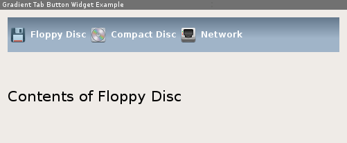
Sometimes when you are just bored by the default QTabWidget and don't want to pull QML dependencies into your project to create a fancy user interface this article might be for you. With the help of QStyle, QBrush, a left-to-right QListWidget we are creating a stylish tab bar that can switch through a QStackedLayout that looks like this (only an example, everything customizable):
What you learn
This tutorial makes use of different features and techniques provided by Qt:
- Resource System The icons you see in the screenshot are loaded via the Qt Resource System
- QBrush For creating the gradient we make use of QLinearGradient that is assigned to a QBrush.
- QPalette Qt has no direct way for setting colors to particular widgets, except using stylesheets, but as far as I know there is no support for gradients yet. So we need to make use of color roles and a customized QPalette
- QListWidget We make use of the flow property to make the items flow horizontally.
Creating a new Project
To make our life easy and get results fast we use QtCreator along this tutorial. So lets create a new project by calling 'File' - 'New File or Project' and select 'Qt Widgets Application'. Follow the Wizard steps and we should end up with a project skeleton containing a form, header and source for the main window.
Preparing the Main Window
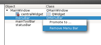
We start by modifying the mainwindow.ui form. Open the Forms folder and double click the .ui file. The form designer opens the empty main window. Since we don't need a tool bar, status bar and menu bar we get rid of them by right-click - 'Remove', either on the item directly or in the object inspector:
Now that we have an empty form we add an item-based 'List Widget' (QListWidget) from the Widget Box and below that a normal widget (QWidget) that will later hold our stacked layout containing the tab pages. Let's give the list widget the name tabBar and the QWidget tabContainer. To make the widgets resize nicely when you resize the main window we select the main window and press the 'Lay Out Vertically' button of the form designer toolbar (or use the Ctrl+L shortcut).
This should give us the following result:

Well, that doesn't look very nice. The list widget going to display the tab icons is way too high. This is because the widget property maximum height does not limit the height for the current layout situation. So we set it to a fixed height, let's say 50:
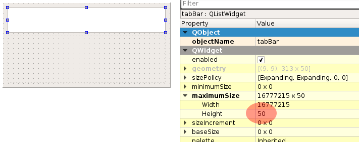
Nice. That's better.
Now we have a QListWidget as the tab bar. But wait, a list? Doesn't a list normally list the items from top to bottom? Yes. But this widget has the flow property we can set to LeftToRight:

Adding the Icon Resources
Now that we have an empty tab bar, let's add some items. But first we need to register a resource file that is going to hold the graphics files. If you want to follow the example from above you can download the icons from here:
Add a new resource file by choosing File - New File or Project. From that dialog select Qt from the template category list on the left and then Qt Resource File. Confirm by clicking on Choose.... Enter the name main.qrc and click Next, then on Finish to confirm the default settings for version management.
Now you should see the resource editor:

Now we need to add a prefix. A prefix can be seen as a virtual folder within a resource file. This technique can be used to group resource files or e.g. create different language sensitive icons. Bear in mind that you are not only limited to graphics. You could also add a license document to the resource file and load it in the about box.
Let's add the prefix called / what happens to be our root prefix. Click on the Add button then choose Add prefix from the popup menu. An automatically named entry /new/prefix1 is created. Remove the text portion so that only / remains in the text field below.
Now while the prefix / is selected you can add some files by clicking Add - Add Files. For the sake of simplicity I assume that the icons are located in the same directory as the rest of the project files. From the File picker you can also select multiple files.
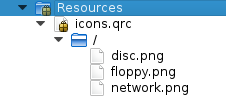
Select the three icon PNG files and click 'Open'. This should result into:
Adding Items to the Tab Bar
Not it's time to add some items to our tab bar. The project wizard created some cpp and header files we just need to modify.
In the mainwindow.cpp we find a constructor that creates the user interface (Ui::MainWindow) if you didn't change the default name. In the constructor the method setupUi is called what initializes the from the included ui_mainwindow.h header file which is in turn created by the uic (User Interface Compiler).
After the initialization we can access the list widget and add some items:
MainWindow::MainWindow(QWidget *parent) :
    QMainWindow(parent),
    ui(new Ui::MainWindow)
{

    ui->setupUi(this);

    QListWidgetItem *item1 = new QListWidgetItem(ui->listWidget);
    item1->setText("Floppy Disc");
    item1->setIcon( QIcon(":/floppy.png") );

    QListWidgetItem *item2 = new QListWidgetItem(ui->listWidget);
    item2->setText("Compact Disc");
    item2->setIcon( QIcon(":/disc.png") );

    QListWidgetItem *item3 = new QListWidgetItem(ui->listWidget);
    item3->setText("Network");
    item3->setIcon( QIcon(":/network.png") );

}
These lines are quite straight-forward:
- create a new QListWidgetItem and pass the list widget from the ui object as the parameter so that it gets added automatically
- set the text for the tab label
- set the icon from the resources we already added
Running our sample application with these modifications results into this:
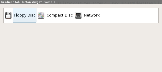
Well, we have items, we have icons and we can select but we are still missing the promised fanciness. The items are now painted using the default style (on my system the GTK-Qt-Style is used). And most important: Still no gradients. Seems like we need some more actors on the stage.
Enter QBrush, QLinearGradient and QPalette
In order to create a linear gradient we need at least three bits of information:
- the coordinates to tell the painter where to start drawing the gradient
- start color the relative position and the start color
- end color the relative position and the end color
Put together we insert right after the line ui->setupUi(this);:
QLinearGradient buttonGradient(0,0,0,ui->listWidget->height());
The QLinearGradient constructor takes four parameters: x1, y1, x2, y2. With these coordinate pairs we can exactly define the interpolated area. In our case we want the background of the list widget being filled entirely by the gradient. Thus we pass as the first coordinate pair 0,0 (start at the upper left corner) and the second 0,ui->listWidget->height() stop at the lower left corner so that the gradient spans the entire height of the list widget.
buttonGradient.setColorAt(0,QColor(100,120,140));
buttonGradient.setColorAt(1,QColor(160,180,200));
These two lines define the start and stop color. The first parameter is the relative position where to set the color. It is a real value ranging from 0 to 1. Here we just define our two colors at 0 and at 1.
So, a gradient definition alone does not do anything useful yet. Now we need to get it painted onto the background. Unfortunately the QWidget class does not come with a method setBackground() or something similar. The Qt user interface classes are completely style-driven. The colors can only be changed by setting them in a palette-object.
The QPalette is responsible for organizing various colors in groups and roles. For detailed information see the documentation link.
For us now it's just important that we need to change the following color roles:
- QPalette::Base: color used to paint the widget background
- QPalette::Highlight: what color to use for the selected item background
- QPalette::HighlightedText: forground color for selected item
- QPalette::Text: forground color for the other non-selected items
The method to use for changing the color is void QPalette::setBrush(ColorRole role, const QBrush & brush). We can assign the new colors directly to the global application wide palette. But that will change the colors for every widget. We want only our list widget to use our custom colors. So we create a copy of the current palette and change only the colors we need.
Directly after the gradient code block we insert:
QPalette palette = qApp->palette();
palette.setBrush( QPalette::Base, buttonGradient );
palette.setBrush( QPalette::Highlight, buttonGradient );
palette.setBrush( QPalette::HighlightedText, Qt::white );
palette.setBrush( QPalette::Text, Qt::white );
Let's see what we've got:
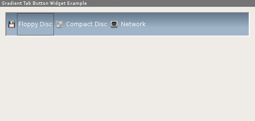
Wow, gradient background. So far, so good. But something is amiss: There is still this ugly focus box displayed around the selected entry. So, let's get rid of this.
MyNoFocusStyle
Removing the focus box involves altering the current style of the widget. For this we need to understand how styles work. Each time a widget is painted on the display different methods of the currently set style are called:
- drawPrimitive
- drawControl
- drawItemPixmap
to name a few. Each of the methods are responsible for different aspects of the underlying layout. We are now interested in the drawPrimitive method:
void QStyle::drawPrimitive(
    PrimitiveElement element,
    const QStyleOption * option,
    QPainter * painter,
    const QWidget * widget = 0) const
that we need to overload in our new class MyNoFocusStyle. Create a new class by calling File - New File or Project.... Select C++ Class from the category C++ and click Choose....
On the next wizard page enter the class name "MyNewFocusStyle" and let it inherit from "QProxyStyle". Finish the wizard and add the drawPrimitive-method to the cpp file (and the method declaration to the header file of course):
void MyNoFocusStyle::drawPrimitive(
     PrimitiveElement element,
     const QStyleOption *option,
     QPainter *painter,
     const QWidget *widget) const
{
    if ( element == PE_FrameFocusRect ) return;
    QProxyStyle::drawPrimitive( element, option, painter, widget );
}
That's it. No rocket science but I think this needs a word of explanation. The focus rectangle in the QStyle world is a so-called Primitive what gets drawn -- you guessed it -- in the drawPrimitive method with the passed PrimitiveElement parameter element. In the enumeration of all primitive elements the focus rectangle has the id 3 or PE_FrameFocusRect.
When our items of the list widget are painted we just want the focus frame not to be drawn. Thus we just return from the drawPrimitive method when the passed element parameter is the focus frame, otherwise we pass all parameters to the parent class QProxyStyle, so that all other primitives are still drawn.
Now we just need to instantiate the new style and assign it to our list widget. Right after ui->setupUi() add the line:
ui->listWidget->setStyle( new MyNoFocusStyle );
Some further beautification can be done via style sheets:
ui->listWidget->setStyleSheet("border: none; font-weight: bold;");
and we are there:
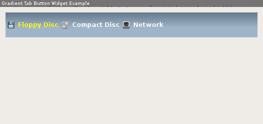
The rest is almost self-explanatory: For each tab page create a new QWidget, put the elements in there, add them to the QStackedLayout that you assigned to the widgetPages of our main window. Finally connect the signal for selection change of the list widget to a change page slot of your main window...
... what has been left as an exercise for the reader.
If you made it this far and like this tutorial you might want to extend/add more features and continue this tutorial.